It's been a really long time coming, but, the end is finally here for the padlock icon in the address bar! 🔒🚫
A Long Road
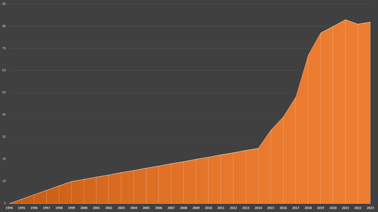
Wow, where do I start?! Whilst the dawn of the encrypted Web was in 1994, with the release of SSLv2.0, the real transition to an encrypted Web didn't start until ~2014, a little after the Snowden revelations. If we look at the % of page loads that have used HTTPS on the Web, you can see when we started putting effort into the problem.

Note that we don't really have any reliable data prior to 2013 because nobody was paying attention, so that section of the graph is my best estimation, but from 2013 onwards we have multiple, reliable sources of data and the graph is accurate.
Along the way to an encrypted Web we've come across HTTPS Anti-Vaxxers, shorter certificates, warnings on HTTP sites, the removal of the EV UI, and countless other major changes in the industry that I've documented well here on my blog. But now, the pièce de résistance, the padlock indicator, is to be retired after almost 30 years of service. To be clear, this was always inevitable. We've seen the removal of the word 'Secure', removal of the green colour, removal of 'https://' in the address bar and now, the removal of the padlock icon. The writing has been on the wall for a long time and there are now a lot of people out there who owe me $1 for losing our bet that 2023 would be the year the padlock was removed!
An Update on the Lock Icon
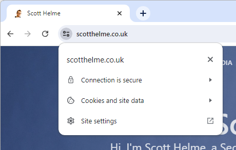
The blog post from Chromium, An Update on the Lock Icon, is short and sweet. It details everything that you'd expect from them, including research and links to sources for data, something that other industry players never seem to be able or willing to provide. But, without further ado, let me introduce you to the replacement for the padlock icon!

This will be hitting desktop variants of Chrome from ~September 2023 and will be following on Android, but not iOS. For iOS, the padlock icon will be removed and will not be replaced by anything. The reasons for choosing this particular icon given by Chromium are:
We think the tune icon:
- Does not imply "trustworthy"
- Is more obviously clickable
- Is commonly associated with settings or other controls
Whilst I can agree with those reasons, I think one of the most important sentences in the blog post is this one:
Replacing the lock icon with a neutral indicator prevents the misunderstanding that the lock icon is associated with the trustworthiness of a page, and emphasises that security should be the default state in Chrome.
The issues of "trust", and what that word really means, along with other confusions around connection security indicators have long plagued the Web, but no more. In addition, the pursuit of a default secure world is one that simply cannot be argued with, and anything that moves us towards that being a reality, including our UI state, is one I'm onboard with. I've enabled the new indicator in my browser just to see what it looks like and, I have to say, it convinced me even more that this is a step in the correct direction.


