I've been playing around with a few of the 'hidden' flags in the Chrome browser and I've come up with a selection of settings that I think really improve the current browsing experience. Here they are if you want to try them out!
The Demo Sites
For this blog I'm going to be using 3 sites to demo the various changes and document how they will all appear differently in the browser after we're done making the changes.
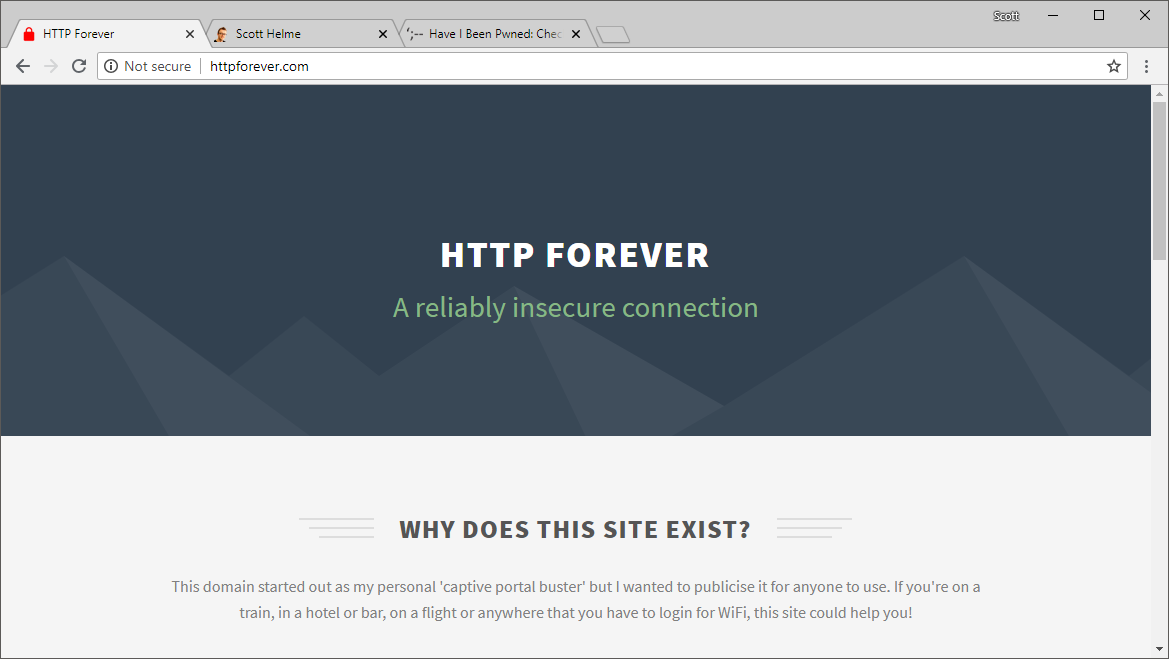
httpforever.com
This is my personal captive portal busting site that I use when I'm out and about travelling. It's served over HTTP and redirects HTTPS to HTTP too.
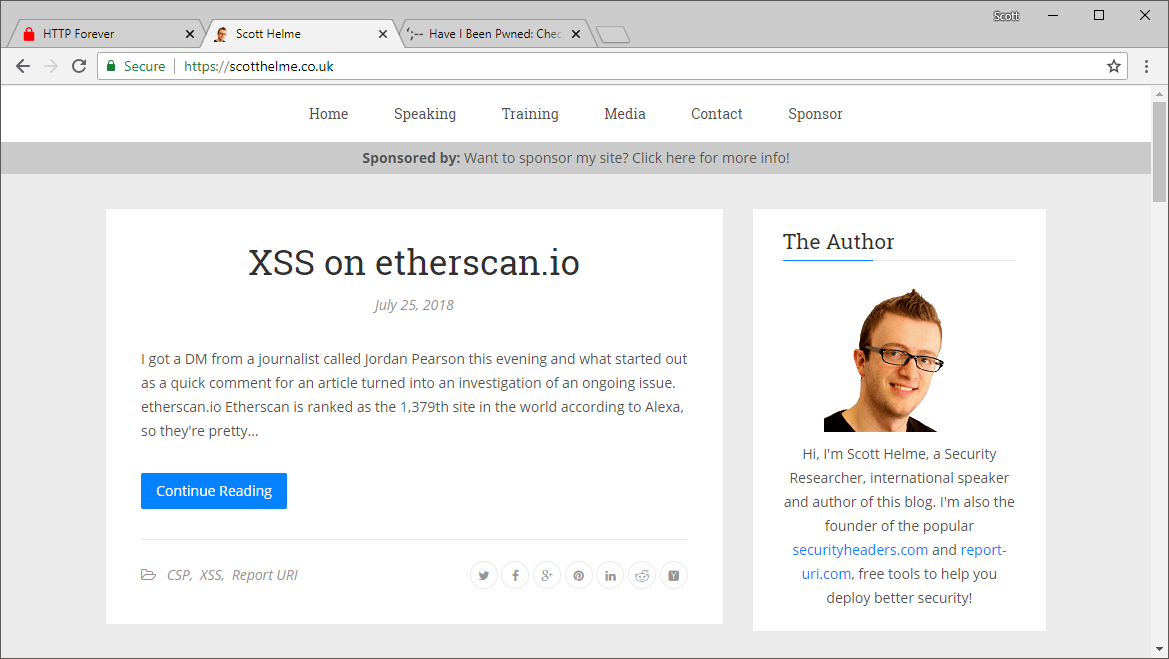
scotthelme.co.uk
This is, of course, the very blog you're reasing right now and has a standard 'DV' certificate in use for HTTPS. I get the typical green 'Secure' text, my padlock icon and https in the address bar.
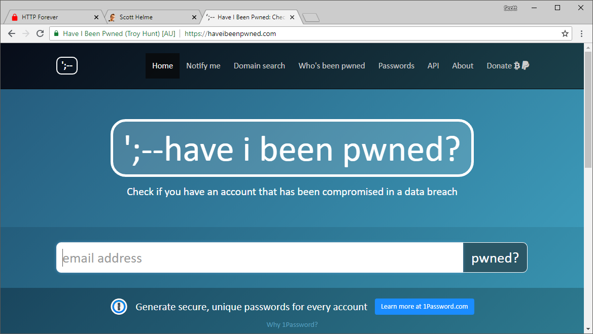
haveibeenpwned.com
This is the awesome breach tracking service from Troy Hunt and I'm using it to demonstrate the 'EV' UI in the browser when the site has a valid EV certificate.
Changing how the browser looks
If you're using Chrome browser and head over to chrome://flags in the address bar, you will find a series of features/settings you can enable, disable and tweak for the browser.
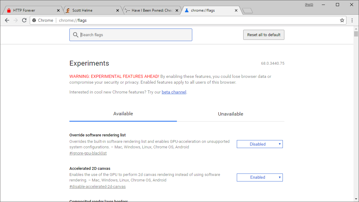
This is where we will be making all of our changes today and is the only page you will need to visit. Each time we make a change you will need to relaunch Chrome so make sure you don't have any tabs open with something that needs saving for the duration of this blog post whilst you're making changes.
Dial up the 'HTTP Bad'
I recently blogged about the changes in Chrome 68 where all HTTP pages will now have the grey 'Not Secure' information on them and I followed that up with another blog and the other changes coming in 2018. What we're going to do now is take those changes and jump forwards to what will probably come some time in 2019, the 'actively dangerous' marker for HTTP sites.
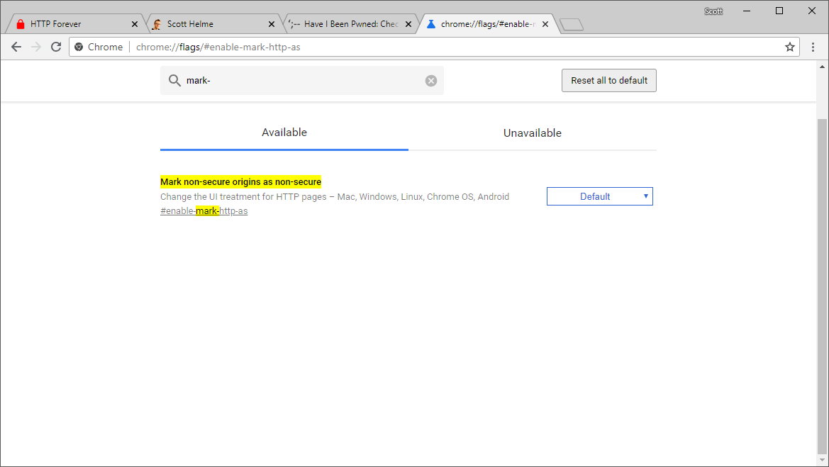
Go to chrome://flags/#enable-mark-http-as in your address bar and you should see the following option on the Chrome flags page.
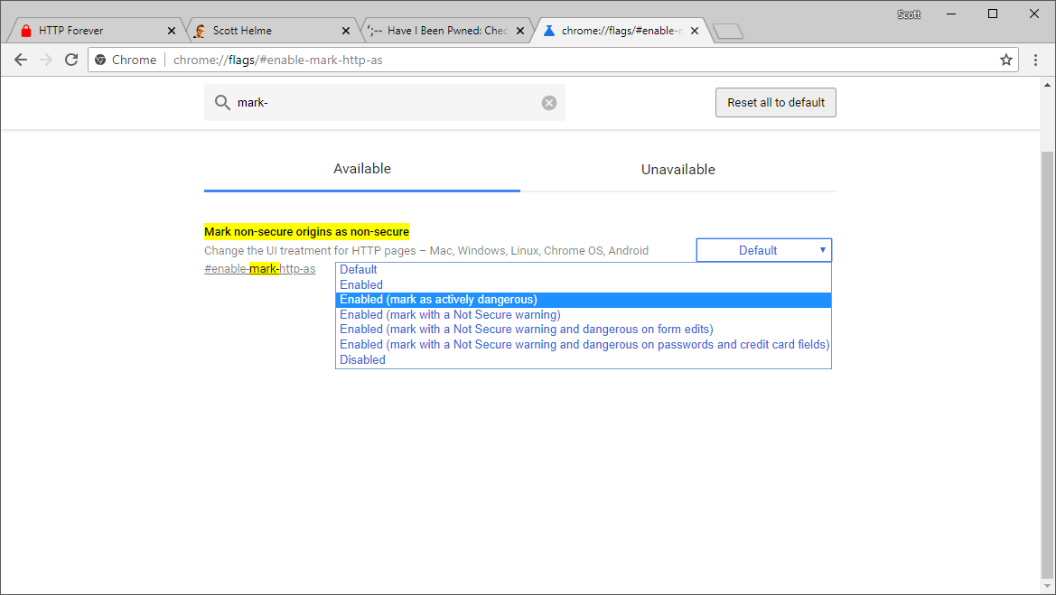
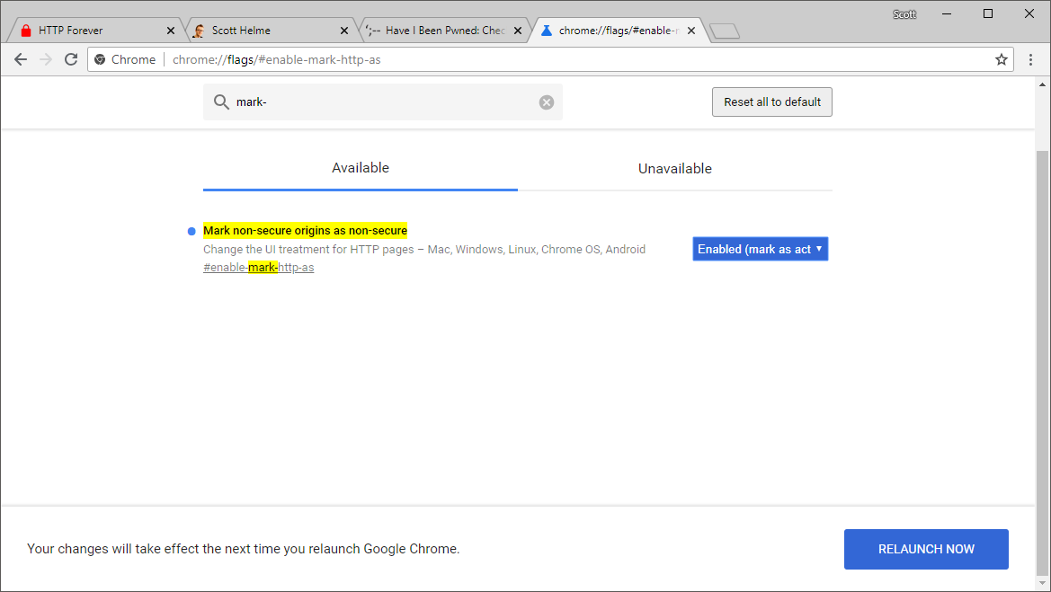
Go ahead and change the setting in the drop down menu to Enabled (mark as actively dangerous) and then click "RELAUNCH NOW".
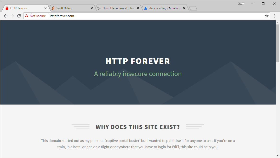
Once the browser has relaunced you can go ahead and take a look at the HTTP site now and see that the 'Not Secure' warning has switched to the red version.
Dial back the 'HTTPS Good'
Next up is to reduce those HTTPS indicators and to do that we need the 'Simplify HTTPS indicator UI' flag which can be found at chrome://flags/#simplify-https-indicator.
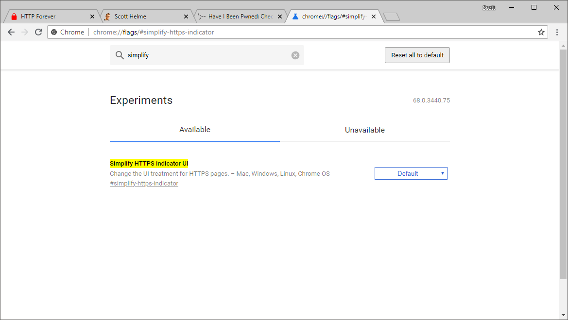
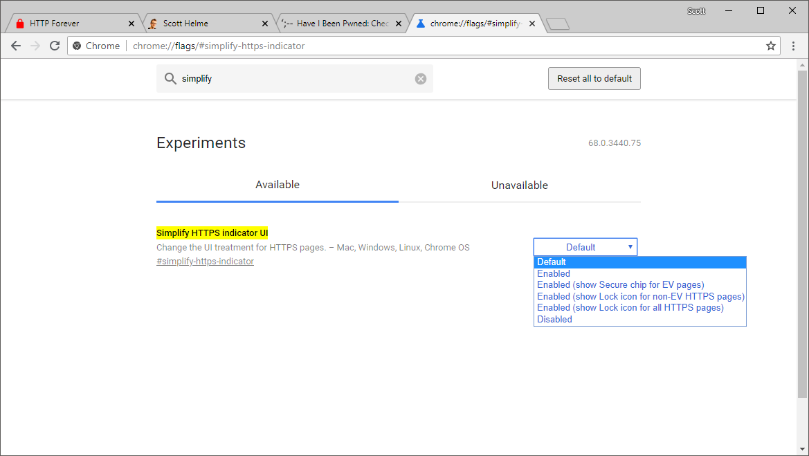
This flag has several options and we're going to look at all of them and then settle on the last one we look at so we can understand all of the different options and what they do.
Secure chip for EV pages
This option downgrades the EV UI so instead of the company name showing, it will show the Secure chip instead.
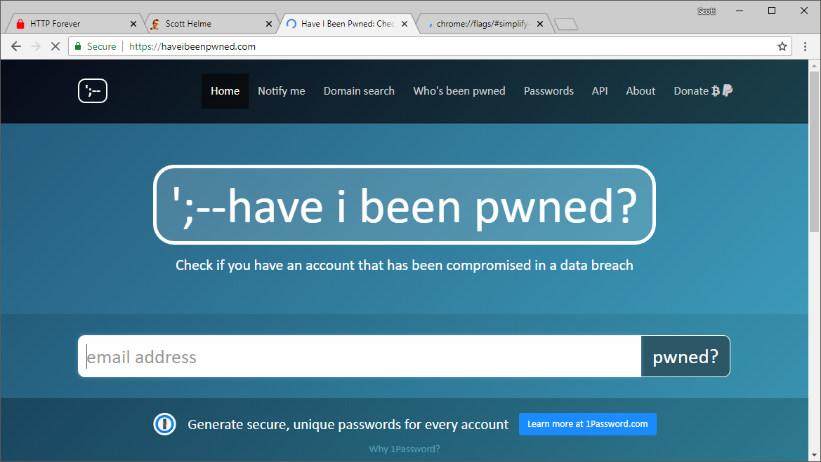
Here you can see the UI has change for haveibeenpwned.com and it now has a Secure chip just like my site with a DV cert.
Lock icon for non-EV HTTPS pages
This options downgrades the Secure chip for sites with DV certificates to show only the lock icon and remove the Secure chip.
![]()
As you can see though, it doesn't affect EV sites which still have their full UI.
![]()
Show lock icon for all HTTPS pages
The last option, and the one we will be keeping, is to show only the lock icon for all HTTPS pages. This downgrades the EV and DV UI to have just the lock icon present.
![]()
![]()
Now there's no distinction between EV and DV, and honestly, the address bar looks a lot less cluttered as a result too!
Simplify Some More
The steps above do introduce some simplicity to the address bar but we can take things a little further. We're going to look at a flag to remove the scheme and certain subdomains from the address bar too. To demo this change, I'm going to temporarily introduce PayPal into the mix. Here's their standard site.
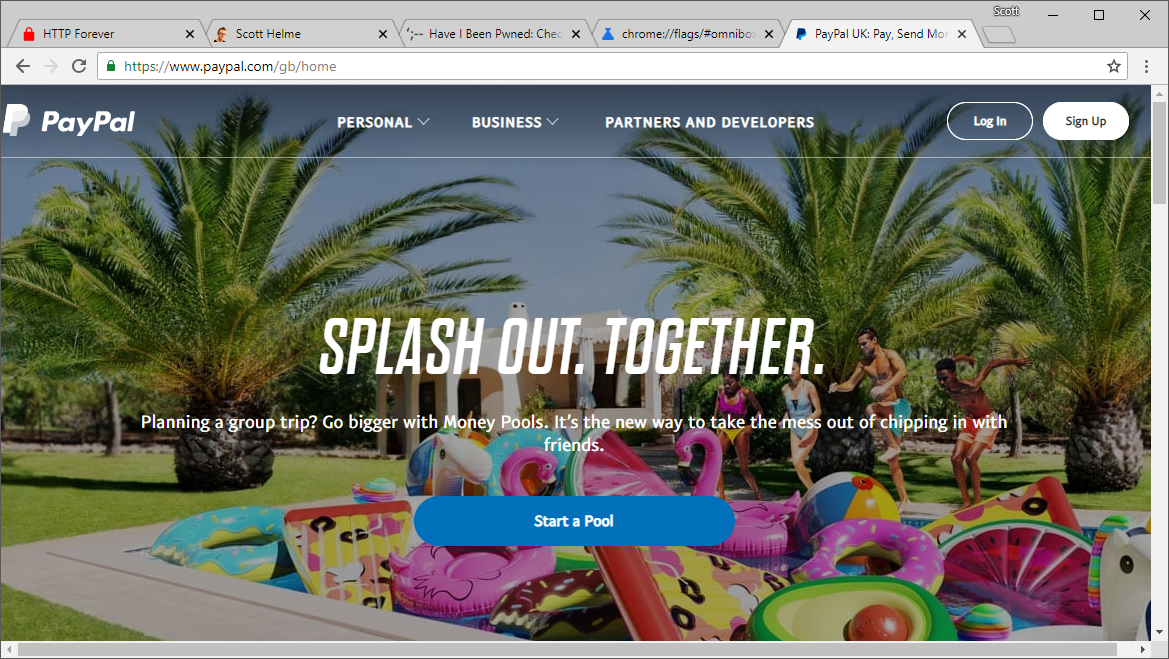
To alter this setting you can head to chrome://flags/#omnibox-ui-hide-steady-state-url-scheme-and-subdomains and flick the switch to Enabled.
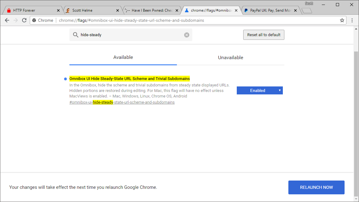
Straight away you can see how much better this change is, take a look at the PayPal site.

To start with, the https:// scheme is now gone from the address bar. Given that we already have the green padlock in the UI. or the EV indicator if we were on the standard UI, does the https:// really add that much? A user is probably going to understand 'green' and 'padlock' a lot better than 'https://' so removing the scheme is a nice first step. You will also notice that the www subdomain is gone too. This subdomain isn't really that important and removing it doesn't really change much. I could understand if it was something like account or login, but it's not and removing it results in a shorter string for the user to have to parse. The only other subdomain this will remove right now is m, presumably for the mobile version of sites (source).
Beautify!
The changes so far have been about the UI but with a security focus on them. These two changes however are purely about aesthetics, and they're pretty epic! You want to set chrome://flags/#top-chrome-md to Refresh and chrome://flags/#secondary-ui-md to Enabled and then re-launch Chrome, and woah!
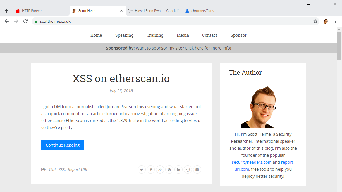
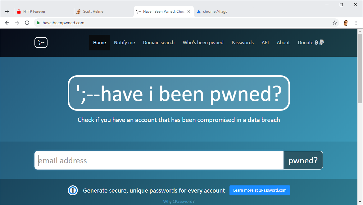
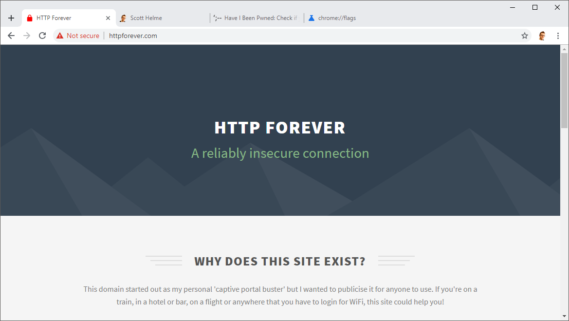
What you're looking at here is the upcoming UI changes to Chrome that are already available on the Canary build but you can have them on stable instead! Enjoy your new browsing experience! 😎
